Flavorus Event Discovery iOS App
Responsibilities: UX Direction / Design / Whiteboard / Research / Project Management
Solution: I’m really happy with the way the app turned out. It might just be the easiest way to buy tickets at Flavorus. It also has the added benefit of being the customer's ticket. Customer app adoption opens up the potential to control messaging during and after the event they purchased tickets to.
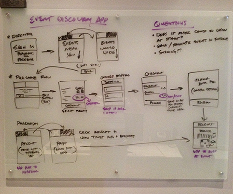
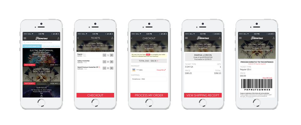
The challenge here was to make the app event focused and to make event discovery and purchase easy. I started thinking of a few user scenarios that would help us decide what features were needed and how to present this information. For the user that just wants to find local events, we need to ask for their location to display relevant events nearby. For a smaller segment of customers that attend larger events regardless of location, we created another tab to populate worldwide events. To search specific event, we add a search bar on both tabs. We placed the "buy tickets" button on the left side of event listing since this is a more accessible area for touch.


Once a customer finds an event, we want the buying process to be fast and easy. This means prioritizing ticket types up front and moving less important details to the "more info" screen. We used steppers for selecting tickets and added a large checkout button fixed to the bottom of the screen so you couldn’t miss it.

The secondary function of the app is the digital wallet, a place where customers will store their tickets. Now they can push their ticket to passbook, or just pull up the stored barcode in the app at entry. This is a huge win for the customer.

We have now created the mobile phone as ticket, and much more... The possibilities are endless...